Are You Ready to Supply Your Company with My Chain Knowledge?
If you’ve made it this far, you’ve seen how I use real data to analyze supply chain performance — from products and customers to shipping methods and delivery delays. I’d love to bring that same energy and insight to your team.
Let’s connect and see how I can help your company turn data into smarter logistics and better decisions.
📨 Email: data@lubobali.com
🔗 Website: www.lubobali.com
💼 LinkedIn: linkedin.com/in/lubo-bali

What I Learned — Hopefully You Did Too
Before starting this project, I used to think that if I ordered something, it would just magically appear on time. But once I started analyzing the data, I realized how many moving parts there are behind the scenes — from product margins to delivery delays to regional performance.
Now I feel a lot more confident about understanding the supply chain process as a whole. I can break it down, question it, and find patterns that help make better decisions — not just rely on stores always having what I want in stock 24/7.
This project showed me that:
Profit isn’t just about what sells the most — it’s about what earns the most per order.
Reliable delivery doesn’t always come from the most expensive shipping option.
Not all customers or regions contribute equally to success — and that’s okay, as long as you know where to focus.
Whether you're managing inventory, planning logistics, or optimizing pricing, knowing how to track performance across products, customers, and delivery methods is key. And now I’ve got the tools — and the experience — to do exactly that.

On-Time or Not? Understanding Shipping Performance in the Supply Chain
Shipping might seem like a backend process, but it plays a huge role in customer satisfaction and profitability. In this part of the project, I wanted to explore how different shipping methods and product categories affect delivery reliability.
Which shipping method has the highest late delivery rate?
Insight
To my surprise, First Class — which sounds like it should be the most reliable — actually had the highest late delivery rate at 37%.
Second Class followed with 30%, while Same Day shipping performed better than both with just 18%.
The most reliable was Standard Class, with only 15% late deliveries.
This made it clear that speed or price doesn’t always equal reliability. If I were managing this operation, I’d look into First Class contracts or fulfillment partners to see why it’s falling behind expectations.
Tech Part
I used a donut chart in Power BI to break down late deliveries by shipping mode.
I calculated late delivery rate using this formula:
Late Delivery Rate =
CALCULATE(COUNT(Order ID), Delivery Status = "Late delivery") / COUNT(Order ID)
Then I grouped the data by Shipping Mode to show which options had the highest percentage of delays. I included percentage labels for easier comparison.
Which product categories have the most delivery issues?
Insight
When I broke delivery performance down by product, I noticed that Fishing and Cardio Equipment had a noticeably higher rate of canceled or late shipments.
In contrast, categories like Cleats, Men’s Footwear, and Women’s Apparel mostly shipped on time or early.
These trouble spots could mean issues with supplier stock, order prep, or even seasonal bottlenecks. It’s something the company might want to investigate further.
Tech Part
I used a stacked bar chart to display delivery outcomes by product category.
Each color in the bar represents a status:
Green = Advance shipping
Blue = On time
Red = Late delivery
Black = Shipping canceled
The data came from a Delivery Status field joined with Category Name, and I used a count of Order Item IDs to get an accurate breakdown.
Where the Money Comes From – A Supply Chain Profit Analysis
In this part of my project, I wanted to break down the biggest sources of profit across products, regions, and customers. I used Power BI to visualize and compare the data in a way that’s easy to explore. Here’s what I found. Explore the Interactive Dashboard bellow.
Which product categories bring in the most profit per order?
Insight
When I looked at profit per order, Computers clearly stood out with an average of $158 earned per sale. That’s more than double the next categories — Garden ($69) and Crafts ($53).
At the other end of the list, products like Boxing & MMA, Water Sports, and Kids' Golf Clubs made less than $25 per order.
This shows where the margins really are. If I were managing this business, I’d focus on pushing high-margin categories like Computers while reviewing whether it’s worth keeping some of the low-profit ones.
Tech Part
I built a bar chart in Power BI showing the average profit per order by category.
To do this, I created a calculated field using this formula:
Profit per Order = SUM(Profit) / DISTINCTCOUNT(Order ID)
This gave me a true average of how much profit each sale actually brings in, instead of just looking at total profit alone. I sorted the categories from highest to lowest and added data labels to make it clear which ones lead.
Where does the company make the most profit?
Insight
When I broke things down by region, two places stood out right away:
Western Europe with $625K in total profit
Central America close behind at $616K
These two areas clearly lead the way. On the other hand, some regions like Central Asia, Canada, and Southern Africa made under $40K in profit. That tells me this business has a few strong markets and a few that might need strategic attention.
Tech Part
I used a horizontal bar chart to show the sum of total profit by region.
To clean it up, I grouped by Order Region, summed up the profit values, and sorted it to highlight the highest-performing areas at the top. I also formatted the bars with thousands and millions for easy reading.
Which customers generate the most sales?
Insight
I was curious who the biggest buyers were — and it turns out, one name kept popping up: Zimmerman.
The top customer, Zimmerman (ID: 4579), spent $4.8K, and several other Zimmerman accounts are in the top 10 too. That’s likely one company using multiple accounts, or a strong B2B relationship.
This could be a great opportunity to build loyalty programs, offer exclusive discounts, or even reach out with upsell offers. It’s clear that a few customers bring in a big share of the money.
Tech Part
I created another bar chart to show the sum of sales by customer.
I used the combined name and ID field (CustomerFull) so I could see exactly who was buying the most. I sorted the list in descending order and limited it to the top 10 customers for a focused view.
Which product categories have the most orders and the highest profit per order?
Insights
Computers had the highest average profit per order, but low sales volume.
Cleats had the most orders and high total sales, but low profit per order.
Fishing, Cardio Equipment, and Camping & Hiking had a good balance of profit and sales.
Many categories (like Women’s Apparel and Footwear) relied on volume, not profit margin.
This visual helped me quickly spot which categories are high-margin niches, which are popular but low-profit, and which strike the best balance.
Tech Part
I used a bubble chart in Power BI with:
X-axis: Total number of orders (Count of
Order Id)Y-axis: Average profit per order (
Order Profit Per Order)Bubble size: Total sales (
Sales)Legend: Product category (
Category Name)
This setup allowed me to compare how popular each product category is, how much profit each order brings in, and how much revenue the category generates overall.
Explore the Interactive Dashboard
What & Where of Dataset
For this project, I used a real-world dataset published by DataCo Global, titled “SMART SUPPLY CHAIN FOR BIG DATA ANALYSIS.” It was made publicly available on Mendeley Data by contributors from the Universidad Central del Ecuador and Instituto Politécnico de Leiria in Portugal.
This dataset captures key operations from provisioning to production, sales, and distribution — the full supply chain journey. It includes both structured data (product orders, inventory, delivery status, etc.) and unstructured data (clickstream logs) — allowing for deep exploration using data analytics or machine learning tools.
Is the Supply Chain Part of Our Everyday Lives?
Absolutely — 100%.
We rarely stop to think about what’s behind the products we grab from store shelves. From groceries to phone chargers, construction materials to car parts — it’s all part of a massive, complex system working behind the scenes. We’ve grown used to 24/7 access to nearly everything… but that convenience hides a fragile reality.
What really powers this invisible machine?
In the next section, you’ll explore a real-life story told through interactive Power BI dashboards — a data-driven look into the $4 million in orders that kept goods flowing across years. Let’s pull back the curtain.

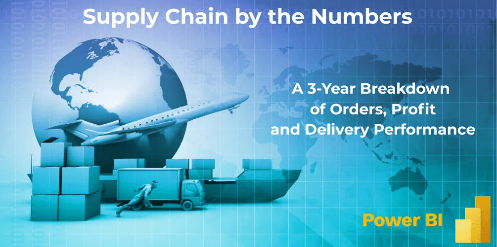
The Real Story Behind $4M in Supply Chain Orders
Why THIS Project?
Supply chains affect all of our lives — we depend on them every day to get food, medicine, and goods delivered to our homes. We all remember 2020, when the pandemic disrupted global logistics and left store shelves empty. That moment showed how fragile and essential supply chains really are.
This project helps us understand how products move, where delays happen, and how businesses generate profit from orders. If supply chains ever break down again, insights like these can help us be better prepared.
I used Power BI to create interactive dashboards that reveal the full story behind $4 million in supply chain orders — from the warehouse to your front door.
Which shipping method has the highest late delivery rate?
Insight
To my surprise, First Class — which sounds like it should be the most reliable — actually had the highest late delivery rate at 37%.
Second Class followed with 30%, while Same Day shipping performed better than both with just 18%.
The most reliable was Standard Class, with only 15% late deliveries.
This made it clear that speed or price doesn’t always equal reliability. If I were managing this operation, I’d look into First Class contracts or fulfillment partners to see why it’s falling behind expectations.
Tech Part
I used a donut chart in Power BI to break down late deliveries by shipping mode.
I calculated late delivery rate using this formula:
Late Delivery Rate =
CALCULATE(COUNT(Order ID), Delivery Status = "Late delivery") / COUNT(Order ID)
Then I grouped the data by Shipping Mode to show which options had the highest percentage of delays. I included percentage labels for easier comparison.
Which product categories have the most delivery issues?
Insight
When I broke delivery performance down by product, I noticed that Fishing and Cardio Equipment had a noticeably higher rate of canceled or late shipments.
In contrast, categories like Cleats, Men’s Footwear, and Women’s Apparel mostly shipped on time or early.
These trouble spots could mean issues with supplier stock, order prep, or even seasonal bottlenecks. It’s something the company might want to investigate further.
Tech Part
I used a stacked bar chart to display delivery outcomes by product category.
Each color in the bar represents a status:
Green = Advance shipping
Blue = On time
Red = Late delivery
Black = Shipping canceled
The data came from a Delivery Status field joined with Category Name, and I used a count of Order Item IDs to get an accurate breakdown.
Where the Money Comes From – A Supply Chain Profit Analysis
In this part of my project, I wanted to break down the biggest sources of profit across products, regions, and customers. I used Power BI to visualize and compare the data in a way that’s easy to explore. Here’s what I found. Explore the Interactive Dashboard bellow.
Which product categories bring in the most profit per order?
Insight
When I looked at profit per order, Computers clearly stood out with an average of $158 earned per sale. That’s more than double the next categories — Garden ($69) and Crafts ($53).
At the other end of the list, products like Boxing & MMA, Water Sports, and Kids' Golf Clubs made less than $25 per order.
This shows where the margins really are. If I were managing this business, I’d focus on pushing high-margin categories like Computers while reviewing whether it’s worth keeping some of the low-profit ones.
Tech Part
I built a bar chart in Power BI showing the average profit per order by category.
To do this, I created a calculated field using this formula:
Profit per Order = SUM(Profit) / DISTINCTCOUNT(Order ID)
This gave me a true average of how much profit each sale actually brings in, instead of just looking at total profit alone. I sorted the categories from highest to lowest and added data labels to make it clear which ones lead.
Where does the company make the most profit?
Insight
When I broke things down by region, two places stood out right away:
Western Europe with $625K in total profit
Central America close behind at $616K
These two areas clearly lead the way. On the other hand, some regions like Central Asia, Canada, and Southern Africa made under $40K in profit. That tells me this business has a few strong markets and a few that might need strategic attention.
Tech Part
I used a horizontal bar chart to show the sum of total profit by region.
To clean it up, I grouped by Order Region, summed up the profit values, and sorted it to highlight the highest-performing areas at the top. I also formatted the bars with thousands and millions for easy reading.
Which customers generate the most sales?
Insight
I was curious who the biggest buyers were — and it turns out, one name kept popping up: Zimmerman.
The top customer, Zimmerman (ID: 4579), spent $4.8K, and several other Zimmerman accounts are in the top 10 too. That’s likely one company using multiple accounts, or a strong B2B relationship.
This could be a great opportunity to build loyalty programs, offer exclusive discounts, or even reach out with upsell offers. It’s clear that a few customers bring in a big share of the money.
Tech Part
I created another bar chart to show the sum of sales by customer.
I used the combined name and ID field (CustomerFull) so I could see exactly who was buying the most. I sorted the list in descending order and limited it to the top 10 customers for a focused view.
Which product categories bring in the most profit per order?
Insights
Computers had the highest average profit per order, but low sales volume.
Cleats had the most orders and high total sales, but low profit per order.
Fishing, Cardio Equipment, and Camping & Hiking had a good balance of profit and sales.
Many categories (like Women’s Apparel and Footwear) relied on volume, not profit margin.
This visual helped me quickly spot which categories are high-margin niches, which are popular but low-profit, and which strike the best balance.
Tech Part
I used a bubble chart in Power BI with:
X-axis: Total number of orders (Count of
Order Id)Y-axis: Average profit per order (
Order Profit Per Order)Bubble size: Total sales (
Sales)Legend: Product category (
Category Name)
This setup allowed me to compare how popular each product category is, how much profit each order brings in, and how much revenue the category generates overall.

What & Where of Dataset
For this project, I used a real-world dataset published by DataCo Global, titled “SMART SUPPLY CHAIN FOR BIG DATA ANALYSIS.” It was made publicly available on Mendeley Data by contributors from the Universidad Central del Ecuador and Instituto Politécnico de Leiria in Portugal.
This dataset captures key operations from provisioning to production, sales, and distribution — the full supply chain journey. It includes both structured data (product orders, inventory, delivery status, etc.) and unstructured data (clickstream logs) — allowing for deep exploration using data analytics or machine learning tools.

Is the Supply Chain Part of Our Everyday Lives?
Absolutely — 100%.
We rarely stop to think about what’s behind the products we grab from store shelves. From groceries to phone chargers, construction materials to car parts — it’s all part of a massive, complex system working behind the scenes. We’ve grown used to 24/7 access to nearly everything… but that convenience hides a fragile reality.
What really powers this invisible machine?
In the next section, you’ll explore a real-life story told through interactive Power BI dashboards — a data-driven look into the $4 million in orders that kept goods flowing across years. Let’s pull back the curtain.

The Real Story Behind $4M in Supply Chain Orders
Why I Did This Project
Supply chains affect all of our lives — we depend on them every day to get food, medicine, and goods delivered to our homes. We all remember 2020, when the pandemic disrupted global logistics and left store shelves empty. That moment showed how fragile and essential supply chains really are.
This project helps us understand how products move, where delays happen, and how businesses generate profit from orders. If supply chains ever break down again, insights like these can help us be better prepared.
I used Power BI to create interactive dashboards that reveal the full story behind $4 million in supply chain orders — from the warehouse to your front door.
Full Analysis – What I Asked the Supply Chain Data?
Full Analysis – What I Asked the Supply Chain Data?
What I Learned — Hopefully You Did Too
Before starting this project, I used to think that if I ordered something, it would just magically appear on time. But once I started analyzing the data, I realized how many moving parts there are behind the scenes — from product margins to delivery delays to regional performance.
Now I feel a lot more confident about understanding the supply chain process as a whole. I can break it down, question it, and find patterns that help make better decisions — not just rely on stores always having what I want in stock 24/7.
This project showed me that:
Profit isn’t just about what sells the most — it’s about what earns the most per order.
Reliable delivery doesn’t always come from the most expensive shipping option.
Not all customers or regions contribute equally to success — and that’s okay, as long as you know where to focus.
Whether you're managing inventory, planning logistics, or optimizing pricing, knowing how to track performance across products, customers, and delivery methods is key. And now I’ve got the tools — and the experience — to do exactly that.
Are You Ready to Supply Your Company with My Chain Knowledge?
If you’ve made it this far, you’ve seen how I use real data to analyze supply chain performance — from products and customers to shipping methods and delivery delays. I’d love to bring that same energy and insight to your team.
Let’s connect and see how I can help your company turn data into smarter logistics and better decisions.
📨 Email: data@lubobali.com
🔗 Website: www.lubobali.com
💼 LinkedIn: linkedin.com/in/lubo-bali