


Total Points Scored (Stacked Bar Chart)
How I Built This Bubble Chart in Tableau?
This stacked bar chart shows how each NBA team scored their total points — and how evenly those points were spread across players.
Chart Type:
I used a stacked vertical bar chart, with each bar representing a team and each colored segment representing an individual player's scoring contribution.Axis:
The y-axis shows total points scored by team. The x-axis displays each team (e.g. MIL, LAL, BOS).Color:
Each player has a unique color to help identify who contributed the most. The color legend is located to the right.Sorting:
Teams are sorted from most to least total points, helping you instantly see which offenses were most productive.Filtering:
I filtered for players with meaningful playing time to avoid clutter from benchwarmers with few points.
What the Chart Reveals (Insights)
This chart quickly reveals which teams relied heavily on one or two stars — like Luka for Dallas or Giannis for Milwaukee — versus teams with more balanced scoring.
It’s an easy way to understand team depth, offensive strategy, and whether a team leans on isolation scoring or shares the ball.
Field Goal Percentage vs. Minutes Played (Scatter Plot)
How I Built This Bubble Chart in Tableau?
This scatter plot visualizes the relationship between Average Field Goal Percentage (FG%) and Minutes Played, with players grouped by minute categories.
Chart Type:
Scatter plot
X-Axis:SUM(Minutes Played)
Y-Axis:AVG(Field Goals %)
Calculated Fields:
Field Goals %
Calculates each player’s shooting efficiency as a percentage.
Minutes Group (Fixed)
Groups players into three categories based on total playing time.
Color Encoding:
Players are color-coded by minute group (High, Medium, Low) for easy comparison.
Tooltip Fields:
Displays Player Name, FG%, and Minutes Played on hover.
Filters Applied:
Only includes players with valid FG% and non-zero minutes.
Role and position filters used to clean inconsistent labels.
Purpose:
Designed to reveal whether playing time affects shooting efficiency across player roles.
What the Chart Reveals (Insights)
The scatter plot shows most high-minute players clustering around average shooting efficiency, while some low-minute players stand out with notably high field goal percentages. This contrast raises an interesting point—certain low-minute players may have demonstrated strong efficiency despite limited court time, suggesting they could have contributed more if given greater playing opportunities.
The chart helps surface these potential underutilized performers and gives a broader view of how efficiency correlates—or doesn’t—with playing time
What Coaches Can Take Away
So, will we predict the next Michael Jordan from this dataset? Not quite. There isn’t one player in this season’s stats who clearly mirrors MJ’s dominance across scoring, efficiency, and minutes. But what we can see is just as valuable — which players are quietly performing at a high level, and which might deserve more minutes on the floor.
This analysis also offers meaningful insights for coaches and trainers. The data makes it easier to identify not just who’s producing, but how they’re doing it — and where they might need improvement. A coach could use charts like these to create personalized development plans, helping players focus on what matters most based on real performance trends.
The numbers don’t tell the full story, but they definitely help shape a smarter one.
Let’s Win This Game
This was more than just a data project — it was a personal deep dive. As a former professional basketball player and coach, I see more than just numbers on a chart. These stats speak to me, and I know how to translate them into real insights that can shape performance.
If you're a professional in sports — not just basketball — and you're looking for someone who can break down the data and give you actionable, high-impact insights, I can help. Let’s work together to turn raw stats into smarter strategies.
If you’d like to see more of what I can do, you can check out my work at lubobali.com or connect with me on LinkedIn. I'm always excited to collaborate where data meets performance.
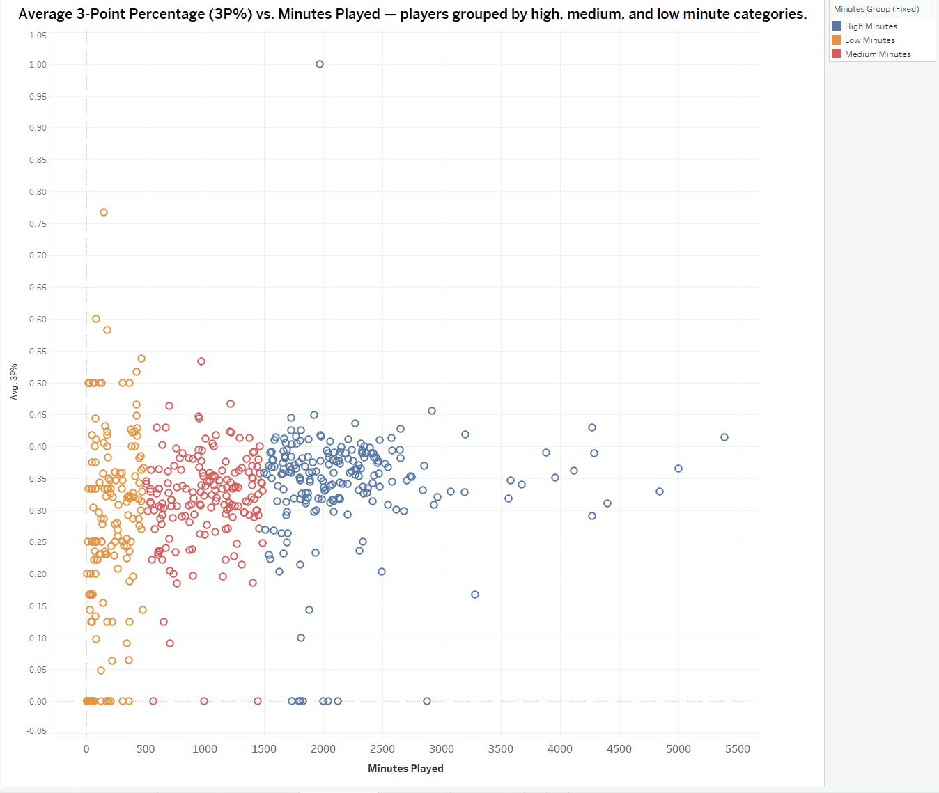
3-Point Percentage vs. Minutes Played (Scatter Plot)
How I Built This Bubble Chart in Tableau?
Chart Type:
Scatter plot comparing 3-point shooting percentage with total minutes played for each NBA player.
X-Axis:SUM(Minutes Played) — total court time across the season.
Y-Axis:AVG(3P%) — a calculated field using the formula:
3P% = [3PM] / [3PA]
This expresses 3-point efficiency as a percentage of shots made out of those attempted.
Color Encoding:
Players are color-coded by Minutes Group (Fixed) — a custom field that classifies players into three categories:
Low Minutes
Medium Minutes
High Minutes
The grouping was based on predefined minute thresholds to allow fair comparisons across playing time levels.
Custom Fields Used:
A calculated field for 3P% using [3PM] / [3PA]
A grouped field for Minutes Group (Fixed)
Filters to exclude entries with 0 attempts or invalid minute data
Cleaning:
Outliers and unclassified players were removed to keep the scatterplot focused and readable.
The visualization avoids clutter by removing extreme edge cases that would distort the scale.
What the Chart Reveals (Insights)
Some low-minute players show surprisingly strong 3-point percentages — in some cases even outperforming high-minute players. This pattern suggests that a few efficient shooters may have been underutilized during the season. The chart helps surface these hidden snipers and invites deeper questions about player development, rotation decisions, and lineup optimization. It’s a useful way to compare shooting efficiency at different usage levels across the league.

Why You Should Keep Reading (and What This Shows About My Skills)
Ever wondered which NBA team truly dominated in total points? Or which players made the most costly mistakes with turnovers? This project answers those questions — and many more — through clean, interactive Tableau visualizations that let you explore the game like a coach or analyst.
You’ll be able to:
Compare field goal and 3-point efficiency across player positions
See which teams rely most on their top scorers
Spot standout shooters who play limited minutes but deliver high accuracy
And yes, find out who’s racking up the most turnovers
From a technical perspective, this project is built entirely in Tableau, using:
Calculated fields for grouping players by minutes played
Custom rankings and level-of-detail (LOD) expressions to identify top performers
Interactive story points and charts like treemaps, bubble plots, and scatter plots
And it’s fully embedded on this page using Framer and HTML for a smooth web experience
I created it not just to show the data — but to let you explore it, ask questions, and come away with your own insights.
Will We Predict the Next Michael Jordan from NBA Stats?
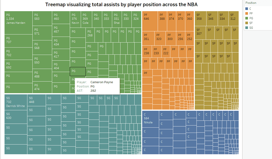
Total Assists (Treemap)
How I Built This Bubble Chart in Tableau?
This treemap shows total assists by player across the NBA.
Chart Type:
Treemap allows you to compare assist volume using block size and group players visually.Size:
Each block represents a player, sized by their total number of assists.Grouping:
Players are grouped by team and filtered to include only the five main positions (PG, SG, SF, PF, C) to remove inconsistent role labels.Color:
Each position is color-coded for fast visual comparison.Filters:
I excluded players with low minutes and cleaned up positional labels to keep the chart focused and readable.
What the Chart Reveals (Insights)
This chart highlights the NBA’s top passers and which teams rely heavily on them.
Point guards dominate the largest blocks — with names like Chris Paul, James Harden, and Trae Young leading in total assists. You can quickly see which teams run their offense through one dominant playmaker, and which spread the role across multiple players.
It’s an easy way to spot elite facilitators and team styles at a glance.
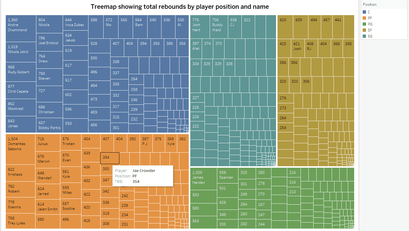
Total Rebounds (Treemap)
How I Built This Bubble Chart in Tableau?
This treemap breaks down total rebounds by player and position using Tableau.
Size:
Each rectangle represents one player. The larger the block, the more total rebounds they recorded during the season.Color:
Players are grouped by position and color-coded for comparison. I filtered the data to only include the five standard positions (C, PF, SF, SG, PG), removing duplicates or inconsistent role labels.Grouping:
Players are automatically nested within position groups to make it easier to compare bigs, wings, and guards separately.Filters:
I excluded players with extremely low minutes to focus the view on high-impact rebounders.Labeling:
Each block shows the player’s name, position, and rebound total. Top performers like Andre Drummond and Nikola Jokić stand out immediately.
What the Chart Reveals (Insights)
Centers still dominate the glass, with names like Drummond, Jokic, and Gobert leading the way. However, some power forwards and even guards appear surprisingly high, showing which teams rely on non-traditional rebounders.
It’s a quick way to see who controls the boards — and who might be quietly doing the dirty work every game.
Total Turnovers (Treemap)
How I Built This Bubble Chart in Tableau?
This treemap shows which NBA players committed the most total turnovers, grouped by position.
Size:
Each block’s size represents a player’s total turnovers during the season. Bigger blocks = more lost possessions.Color:
Players are color-coded by position (PG, SG, SF, PF, C) to make it easier to compare across roles.Grouping:
All players are organized by position to highlight where the most mistakes are happening by role.Filters:
I cleaned up position labels to include only five standard types, and excluded players with low minutes to avoid skewing the chart with anomalies.Labeling:
Each block includes the player’s name, position, and turnover count. High-turnover players like James Harden and Domantas Sabonis stand out clearly.
What the Chart Reveals (Insights)
Point guards have the highest turnover totals — expected, since they handle the ball most. But big men like Sabonis and Jokic also show up, often because they act as passing hubs.
This chart helps spot the riskier playmakers, and shows which positions or players may be hurting their teams with poor ball control.
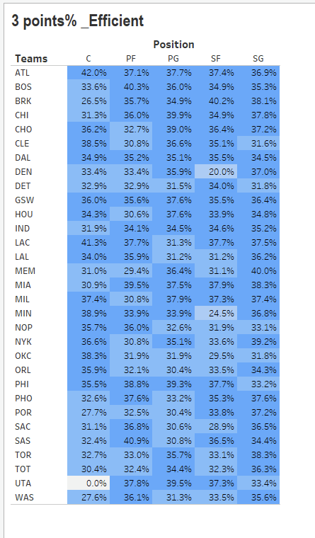
3-Point Shooting Efficiency by Position (Heatmap Table)
How I Built This Bubble Chart in Tableau?
This heatmap shows 3-point shooting efficiency by position for every NBA team.
Layout:
I used a pivot table format with teams as rows and positions (C, PF, PG, SF, SG) as columns. Each cell shows the 3P% for that team and position.Color:
I applied a blue gradient to the 3-point percentage values. Darker shades represent higher shooting efficiency, making it easy to spot hot zones and cold zones.Sorting:
Teams are not ranked but displayed alphabetically, allowing equal comparison across the league.Data Prep:
I used Tableau’s calculated fields to compute 3P% as total 3-pointers made divided by total 3-point attempts for each team-position pair.Cleaning:
I removed outliers and invalid rows (e.g., zero attempts or unclassified players) to make the color scale meaningful.
What the Chart Reveals (Insights)
You can quickly see which positions dominate the arc on each team. Some teams get strong 3P% from their centers (like ATL), while others rely on wings and guards.
It helps compare how different teams build spacing and which lineups are the most dangerous from deep range.
Full Analysis – 8 NBA Charts That Tell the Story
Can the next Michael Jordan be found in this data?
Bubble Chart (Points, Assists, Rebounds)
Who are the most complete players across multiple stat categories — and can we spot the next all-around superstar?Total Assists (Treemap)
Which player positions dominate ball distribution across the league — and who stands out in each role?Total Rebounds (Treemap)
Are centers still kings of the boards, or are other positions catching up in rebounding power?Total Turnovers (Treemap)
Which positions are making the most mistakes — and which players are costing their teams the ball most often?3-Point Shooting Efficiency by Position (Heatmap Table)
Which NBA teams and positions lead in 3-point efficiency — and where are the weak spots from the arc?Total Points Scored (Stacked Bar Chart)
Which NBA teams relied most on individual stars — and which had a more balanced scoring roster?Field Goal Percentage vs. Minutes Played (Scatter Plot)
Do high-minute players maintain shooting efficiency — or does performance dip with more court time?3-Point Percentage vs. Minutes Played (Scatter Plot)
Are elite 3-point shooters given more playing time — or does volume shooting bring down accuracy?


Let’s Win This Game
This was more than just a data project — it was a personal deep dive. As a former professional basketball player and coach, I see more than just numbers on a chart. These stats speak to me, and I know how to translate them into real insights that can shape performance.
If you're a professional in sports — not just basketball — and you're looking for someone who can break down the data and give you actionable, high-impact insights, I can help. Let’s work together to turn raw stats into smarter strategies.
If you’d like to see more of what I can do, you can check out my work at lubobali.com or connect with me on LinkedIn. I'm always excited to collaborate where data meets performance.


What Coaches Can Take Away
So, will we predict the next Michael Jordan from this dataset? Not quite. There isn’t one player in this season’s stats who clearly mirrors MJ’s dominance across scoring, efficiency, and minutes. But what we can see is just as valuable — which players are quietly performing at a high level, and which might deserve more minutes on the floor.
This analysis also offers meaningful insights for coaches and trainers. The data makes it easier to identify not just who’s producing, but how they’re doing it — and where they might need improvement. A coach could use charts like these to create personalized development plans, helping players focus on what matters most based on real performance trends.
The numbers don’t tell the full story, but they definitely help shape a smarter one.
Why You Should Keep Reading (and What This Shows About My Skills)
Ever wondered which NBA team truly dominated in total points? Or which players made the most costly mistakes with turnovers? This project answers those questions — and many more — through clean, interactive Tableau visualizations that let you explore the game like a coach or analyst.
You’ll be able to:
Compare field goal and 3-point efficiency across player positions
See which teams rely most on their top scorers
Spot standout shooters who play limited minutes but deliver high accuracy
And yes, find out who’s racking up the most turnovers
From a technical perspective, this project is built entirely in Tableau, using:
Calculated fields for grouping players by minutes played
Custom rankings and level-of-detail (LOD) expressions to identify top performers
Interactive story points and charts like treemaps, bubble plots, and scatter plots
And it’s fully embedded on this page using Framer and HTML for a smooth web experience
I created it not just to show the data — but to let you explore it, ask questions, and come away with your own insights.
3-Point Percentage vs. Minutes Played (Scatter Plot)
How I Built This Bubble Chart in Tableau?
Chart Type:
Scatter plot comparing 3-point shooting percentage with total minutes played for each NBA player.
X-Axis:SUM(Minutes Played) — total court time across the season.
Y-Axis:AVG(3P%) — a calculated field using the formula:
3P% = [3PM] / [3PA]
This expresses 3-point efficiency as a percentage of shots made out of those attempted.
Color Encoding:
Players are color-coded by Minutes Group (Fixed) — a custom field that classifies players into three categories:
Low Minutes
Medium Minutes
High Minutes
The grouping was based on predefined minute thresholds to allow fair comparisons across playing time levels.
Custom Fields Used:
A calculated field for 3P% using [3PM] / [3PA]
A grouped field for Minutes Group (Fixed)
Filters to exclude entries with 0 attempts or invalid minute data
Cleaning:
Outliers and unclassified players were removed to keep the scatterplot focused and readable.
The visualization avoids clutter by removing extreme edge cases that would distort the scale.
What the Chart Reveals (Insights)
Some low-minute players show surprisingly strong 3-point percentages — in some cases even outperforming high-minute players. This pattern suggests that a few efficient shooters may have been underutilized during the season. The chart helps surface these hidden snipers and invites deeper questions about player development, rotation decisions, and lineup optimization. It’s a useful way to compare shooting efficiency at different usage levels across the league.
Field Goal Percentage vs. Minutes Played (Scatter Plot)
How I Built This Bubble Chart in Tableau?
This scatter plot visualizes the relationship between Average Field Goal Percentage (FG%) and Minutes Played, with players grouped by minute categories.
Chart Type:
Scatter plot
X-Axis:SUM(Minutes Played)
Y-Axis:AVG(Field Goals %)
Calculated Fields:
Field Goals %
Calculates each player’s shooting efficiency as a percentage.
Minutes Group (Fixed)
Groups players into three categories based on total playing time.
Color Encoding:
Players are color-coded by minute group (High, Medium, Low) for easy comparison.
Tooltip Fields:
Displays Player Name, FG%, and Minutes Played on hover.
Filters Applied:
Only includes players with valid FG% and non-zero minutes.
Role and position filters used to clean inconsistent labels.
Purpose:
Designed to reveal whether playing time affects shooting efficiency across player roles.
What the Chart Reveals (Insights)
The scatter plot shows most high-minute players clustering around average shooting efficiency, while some low-minute players stand out with notably high field goal percentages. This contrast raises an interesting point—certain low-minute players may have demonstrated strong efficiency despite limited court time, suggesting they could have contributed more if given greater playing opportunities.
The chart helps surface these potential underutilized performers and gives a broader view of how efficiency correlates—or doesn’t—with playing time
Why You Should Keep Reading (and What This Shows About My Skills)
Ever wondered which NBA team truly dominated in total points? Or which players made the most costly mistakes with turnovers? This project answers those questions — and many more — through clean, interactive Tableau visualizations that let you explore the game like a coach or analyst.
You’ll be able to:
Compare field goal and 3-point efficiency across player positions
See which teams rely most on their top scorers
Spot standout shooters who play limited minutes but deliver high accuracy
And yes, find out who’s racking up the most turnovers
From a technical perspective, this project is built entirely in Tableau, using:
Calculated fields for grouping players by minutes played
Custom rankings and level-of-detail (LOD) expressions to identify top performers
Interactive story points and charts like treemaps, bubble plots, and scatter plots
And it’s fully embedded on this page using Framer and HTML for a smooth web experience
I created it not just to show the data — but to let you explore it, ask questions, and come away with your own insights.
Total Points Scored (Stacked Bar Chart)
How I Built This Bubble Chart in Tableau?
This stacked bar chart shows how each NBA team scored their total points — and how evenly those points were spread across players.
Chart Type:
I used a stacked vertical bar chart, with each bar representing a team and each colored segment representing an individual player's scoring contribution.Axis:
The y-axis shows total points scored by team. The x-axis displays each team (e.g. MIL, LAL, BOS).Color:
Each player has a unique color to help identify who contributed the most. The color legend is located to the right.Sorting:
Teams are sorted from most to least total points, helping you instantly see which offenses were most productive.Filtering:
I filtered for players with meaningful playing time to avoid clutter from benchwarmers with few points.
Why You Should Keep Reading (and What This Shows About My Skills)
Ever wondered which NBA team truly dominated in total points? Or which players made the most costly mistakes with turnovers? This project answers those questions — and many more — through clean, interactive Tableau visualizations that let you explore the game like a coach or analyst.
You’ll be able to:
Compare field goal and 3-point efficiency across player positions
See which teams rely most on their top scorers
Spot standout shooters who play limited minutes but deliver high accuracy
And yes, find out who’s racking up the most turnovers
From a technical perspective, this project is built entirely in Tableau, using:
Calculated fields for grouping players by minutes played
Custom rankings and level-of-detail (LOD) expressions to identify top performers
Interactive story points and charts like treemaps, bubble plots, and scatter plots
And it’s fully embedded on this page using Framer and HTML for a smooth web experience
I created it not just to show the data — but to let you explore it, ask questions, and come away with your own insights.
What the Chart Reveals (Insights)
This chart quickly reveals which teams relied heavily on one or two stars — like Luka for Dallas or Giannis for Milwaukee — versus teams with more balanced scoring.
It’s an easy way to understand team depth, offensive strategy, and whether a team leans on isolation scoring or shares the ball.
Why You Should Keep Reading (and What This Shows About My Skills)
Ever wondered which NBA team truly dominated in total points? Or which players made the most costly mistakes with turnovers? This project answers those questions — and many more — through clean, interactive Tableau visualizations that let you explore the game like a coach or analyst.
You’ll be able to:
Compare field goal and 3-point efficiency across player positions
See which teams rely most on their top scorers
Spot standout shooters who play limited minutes but deliver high accuracy
And yes, find out who’s racking up the most turnovers
From a technical perspective, this project is built entirely in Tableau, using:
Calculated fields for grouping players by minutes played
Custom rankings and level-of-detail (LOD) expressions to identify top performers
Interactive story points and charts like treemaps, bubble plots, and scatter plots
And it’s fully embedded on this page using Framer and HTML for a smooth web experience
I created it not just to show the data — but to let you explore it, ask questions, and come away with your own insights.
3-Point Shooting Efficiency by Position (Heatmap Table)
How I Built This Bubble Chart in Tableau?
This heatmap shows 3-point shooting efficiency by position for every NBA team.
Layout:
I used a pivot table format with teams as rows and positions (C, PF, PG, SF, SG) as columns. Each cell shows the 3P% for that team and position.Color:
I applied a blue gradient to the 3-point percentage values. Darker shades represent higher shooting efficiency, making it easy to spot hot zones and cold zones.Sorting:
Teams are not ranked but displayed alphabetically, allowing equal comparison across the league.Data Prep:
I used Tableau’s calculated fields to compute 3P% as total 3-pointers made divided by total 3-point attempts for each team-position pair.Cleaning:
I removed outliers and invalid rows (e.g., zero attempts or unclassified players) to make the color scale meaningful.
Why You Should Keep Reading (and What This Shows About My Skills)
Ever wondered which NBA team truly dominated in total points? Or which players made the most costly mistakes with turnovers? This project answers those questions — and many more — through clean, interactive Tableau visualizations that let you explore the game like a coach or analyst.
You’ll be able to:
Compare field goal and 3-point efficiency across player positions
See which teams rely most on their top scorers
Spot standout shooters who play limited minutes but deliver high accuracy
And yes, find out who’s racking up the most turnovers
From a technical perspective, this project is built entirely in Tableau, using:
Calculated fields for grouping players by minutes played
Custom rankings and level-of-detail (LOD) expressions to identify top performers
Interactive story points and charts like treemaps, bubble plots, and scatter plots
And it’s fully embedded on this page using Framer and HTML for a smooth web experience
I created it not just to show the data — but to let you explore it, ask questions, and come away with your own insights.
What the Chart Reveals (Insights)
You can quickly see which positions dominate the arc on each team. Some teams get strong 3P% from their centers (like ATL), while others rely on wings and guards.
It helps compare how different teams build spacing and which lineups are the most dangerous from deep range.
Why You Should Keep Reading (and What This Shows About My Skills)
Ever wondered which NBA team truly dominated in total points? Or which players made the most costly mistakes with turnovers? This project answers those questions — and many more — through clean, interactive Tableau visualizations that let you explore the game like a coach or analyst.
You’ll be able to:
Compare field goal and 3-point efficiency across player positions
See which teams rely most on their top scorers
Spot standout shooters who play limited minutes but deliver high accuracy
And yes, find out who’s racking up the most turnovers
From a technical perspective, this project is built entirely in Tableau, using:
Calculated fields for grouping players by minutes played
Custom rankings and level-of-detail (LOD) expressions to identify top performers
Interactive story points and charts like treemaps, bubble plots, and scatter plots
And it’s fully embedded on this page using Framer and HTML for a smooth web experience
I created it not just to show the data — but to let you explore it, ask questions, and come away with your own insights.
Total Turnovers (Treemap)
How I Built This Bubble Chart in Tableau?
This treemap shows which NBA players committed the most total turnovers, grouped by position.
Size:
Each block’s size represents a player’s total turnovers during the season. Bigger blocks = more lost possessions.Color:
Players are color-coded by position (PG, SG, SF, PF, C) to make it easier to compare across roles.Grouping:
All players are organized by position to highlight where the most mistakes are happening by role.Filters:
I cleaned up position labels to include only five standard types, and excluded players with low minutes to avoid skewing the chart with anomalies.Labeling:
Each block includes the player’s name, position, and turnover count. High-turnover players like James Harden and Domantas Sabonis stand out clearly.
Why You Should Keep Reading (and What This Shows About My Skills)
Ever wondered which NBA team truly dominated in total points? Or which players made the most costly mistakes with turnovers? This project answers those questions — and many more — through clean, interactive Tableau visualizations that let you explore the game like a coach or analyst.
You’ll be able to:
Compare field goal and 3-point efficiency across player positions
See which teams rely most on their top scorers
Spot standout shooters who play limited minutes but deliver high accuracy
And yes, find out who’s racking up the most turnovers
From a technical perspective, this project is built entirely in Tableau, using:
Calculated fields for grouping players by minutes played
Custom rankings and level-of-detail (LOD) expressions to identify top performers
Interactive story points and charts like treemaps, bubble plots, and scatter plots
And it’s fully embedded on this page using Framer and HTML for a smooth web experience
I created it not just to show the data — but to let you explore it, ask questions, and come away with your own insights.

What the Chart Reveals (Insights)
Point guards have the highest turnover totals — expected, since they handle the ball most. But big men like Sabonis and Jokic also show up, often because they act as passing hubs.
This chart helps spot the riskier playmakers, and shows which positions or players may be hurting their teams with poor ball control.
Why You Should Keep Reading (and What This Shows About My Skills)
Ever wondered which NBA team truly dominated in total points? Or which players made the most costly mistakes with turnovers? This project answers those questions — and many more — through clean, interactive Tableau visualizations that let you explore the game like a coach or analyst.
You’ll be able to:
Compare field goal and 3-point efficiency across player positions
See which teams rely most on their top scorers
Spot standout shooters who play limited minutes but deliver high accuracy
And yes, find out who’s racking up the most turnovers
From a technical perspective, this project is built entirely in Tableau, using:
Calculated fields for grouping players by minutes played
Custom rankings and level-of-detail (LOD) expressions to identify top performers
Interactive story points and charts like treemaps, bubble plots, and scatter plots
And it’s fully embedded on this page using Framer and HTML for a smooth web experience
I created it not just to show the data — but to let you explore it, ask questions, and come away with your own insights.
Total Rebounds (Treemap)
How I Built This Bubble Chart in Tableau?
This treemap breaks down total rebounds by player and position using Tableau.
Size:
Each rectangle represents one player. The larger the block, the more total rebounds they recorded during the season.Color:
Players are grouped by position and color-coded for comparison. I filtered the data to only include the five standard positions (C, PF, SF, SG, PG), removing duplicates or inconsistent role labels.Grouping:
Players are automatically nested within position groups to make it easier to compare bigs, wings, and guards separately.Filters:
I excluded players with extremely low minutes to focus the view on high-impact rebounders.Labeling:
Each block shows the player’s name, position, and rebound total. Top performers like Andre Drummond and Nikola Jokić stand out immediately.
Why You Should Keep Reading (and What This Shows About My Skills)
Ever wondered which NBA team truly dominated in total points? Or which players made the most costly mistakes with turnovers? This project answers those questions — and many more — through clean, interactive Tableau visualizations that let you explore the game like a coach or analyst.
You’ll be able to:
Compare field goal and 3-point efficiency across player positions
See which teams rely most on their top scorers
Spot standout shooters who play limited minutes but deliver high accuracy
And yes, find out who’s racking up the most turnovers
From a technical perspective, this project is built entirely in Tableau, using:
Calculated fields for grouping players by minutes played
Custom rankings and level-of-detail (LOD) expressions to identify top performers
Interactive story points and charts like treemaps, bubble plots, and scatter plots
And it’s fully embedded on this page using Framer and HTML for a smooth web experience
I created it not just to show the data — but to let you explore it, ask questions, and come away with your own insights.
What the Chart Reveals (Insights)
Centers still dominate the glass, with names like Drummond, Jokic, and Gobert leading the way. However, some power forwards and even guards appear surprisingly high, showing which teams rely on non-traditional rebounders.
It’s a quick way to see who controls the boards — and who might be quietly doing the dirty work every game.
Why You Should Keep Reading (and What This Shows About My Skills)
Ever wondered which NBA team truly dominated in total points? Or which players made the most costly mistakes with turnovers? This project answers those questions — and many more — through clean, interactive Tableau visualizations that let you explore the game like a coach or analyst.
You’ll be able to:
Compare field goal and 3-point efficiency across player positions
See which teams rely most on their top scorers
Spot standout shooters who play limited minutes but deliver high accuracy
And yes, find out who’s racking up the most turnovers
From a technical perspective, this project is built entirely in Tableau, using:
Calculated fields for grouping players by minutes played
Custom rankings and level-of-detail (LOD) expressions to identify top performers
Interactive story points and charts like treemaps, bubble plots, and scatter plots
And it’s fully embedded on this page using Framer and HTML for a smooth web experience
I created it not just to show the data — but to let you explore it, ask questions, and come away with your own insights.
Bubble Chart (Points, Assists, Rebounds)
How I Built This Bubble Chart in Tableau?
This visualization was designed to compare three key performance stats — points, assists, and rebounds — across all NBA players.
Chart Type:
I selected a bubble chart because it allows for visualizing three numeric dimensions at once — using x-position, y-position, and bubble size.
Axis Setup:
X-Axis: Points (Total Points Scored by each player)
Y-Axis: Assists (Total Assists)
Size of Bubble: Rebounds (Total Rebounds)
Color:
Each bubble’s color represents the player’s position (e.g., PG, SG, SF, PF, C) to make role-based patterns easier to spot.
Labels:
I enabled player name labels to identify standout performers like James Harden, Nikola Jokić, or Chris Paul directly on the chart.
Filters:
I filtered out players with extremely low minutes to avoid noise from benchwarmers.
All stats were pulled directly without normalization per minute to emphasize overall production.
What the Chart Reveals (Insights)
This chart highlights the NBA’s most well-rounded players — those who contribute across points, assists, and rebounds.
Nikola Jokić stands out with high stats in all three areas, showing MVP-level impact. Harden and Chris Paul lead in assists, while players like Luka Dončić and LaMelo Ball combine scoring and playmaking with strong rebounding.
If you’re looking for the next all-around superstar, watch for players with bubbles that are far right, high up, and large — the data equivalent of triple-threat potential.
Total Assists (Treemap)
How I Built This Bubble Chart in Tableau?
This treemap shows total assists by player across the NBA.
Chart Type:
Treemap allows you to compare assist volume using block size and group players visually.Size:
Each block represents a player, sized by their total number of assists.Grouping:
Players are grouped by team and filtered to include only the five main positions (PG, SG, SF, PF, C) to remove inconsistent role labels.Color:
Each position is color-coded for fast visual comparison.Filters:
I excluded players with low minutes and cleaned up positional labels to keep the chart focused and readable.
What the Chart Reveals (Insights)
This chart highlights the NBA’s top passers and which teams rely heavily on them.
Point guards dominate the largest blocks — with names like Chris Paul, James Harden, and Trae Young leading in total assists. You can quickly see which teams run their offense through one dominant playmaker, and which spread the role across multiple players.
It’s an easy way to spot elite facilitators and team styles at a glance.
Why You Should Keep Reading (and What This Shows About My Skills)
Ever wondered which NBA team truly dominated in total points? Or which players made the most costly mistakes with turnovers? This project answers those questions — and many more — through clean, interactive Tableau visualizations that let you explore the game like a coach or analyst.
You’ll be able to:
Compare field goal and 3-point efficiency across player positions
See which teams rely most on their top scorers
Spot standout shooters who play limited minutes but deliver high accuracy
And yes, find out who’s racking up the most turnovers
From a technical perspective, this project is built entirely in Tableau, using:
Calculated fields for grouping players by minutes played
Custom rankings and level-of-detail (LOD) expressions to identify top performers
Interactive story points and charts like treemaps, bubble plots, and scatter plots
And it’s fully embedded on this page using Framer and HTML for a smooth web experience
I created it not just to show the data — but to let you explore it, ask questions, and come away with your own insights.
What the Chart Reveals (Insights)
This chart highlights the NBA’s most well-rounded players — those who contribute across points, assists, and rebounds.
Nikola Jokić stands out with high stats in all three areas, showing MVP-level impact. Harden and Chris Paul lead in assists, while players like Luka Dončić and LaMelo Ball combine scoring and playmaking with strong rebounding.
If you’re looking for the next all-around superstar, watch for players with bubbles that are far right, high up, and large — the data equivalent of triple-threat potential.
Why You Should Keep Reading (and What This Shows About My Skills)
Ever wondered which NBA team truly dominated in total points? Or which players made the most costly mistakes with turnovers? This project answers those questions — and many more — through clean, interactive Tableau visualizations that let you explore the game like a coach or analyst.
You’ll be able to:
Compare field goal and 3-point efficiency across player positions
See which teams rely most on their top scorers
Spot standout shooters who play limited minutes but deliver high accuracy
And yes, find out who’s racking up the most turnovers
From a technical perspective, this project is built entirely in Tableau, using:
Calculated fields for grouping players by minutes played
Custom rankings and level-of-detail (LOD) expressions to identify top performers
Interactive story points and charts like treemaps, bubble plots, and scatter plots
And it’s fully embedded on this page using Framer and HTML for a smooth web experience
I created it not just to show the data — but to let you explore it, ask questions, and come away with your own insights.
Bubble Chart (Points, Assists, Rebounds)
How I Built This Bubble Chart in Tableau?
This visualization was designed to compare three key performance stats — points, assists, and rebounds — across all NBA players.
Chart Type:
I selected a bubble chart because it allows for visualizing three numeric dimensions at once — using x-position, y-position, and bubble size.Axis Setup:
X-Axis: Points (Total Points Scored by each player)
Y-Axis: Assists (Total Assists)
Size of Bubble: Rebounds (Total Rebounds)
Color:
Each bubble’s color represents the player’s position (e.g., PG, SG, SF, PF, C) to make role-based patterns easier to spot.Labels:
I enabled player name labels to identify standout performers like James Harden, Nikola Jokić, or Chris Paul directly on the chart.Filters:
I filtered out players with extremely low minutes to avoid noise from benchwarmers.
All stats were pulled directly without normalization per minute to emphasize overall production.
Why You Should Keep Reading (and What This Shows About My Skills)
Ever wondered which NBA team truly dominated in total points? Or which players made the most costly mistakes with turnovers? This project answers those questions — and many more — through clean, interactive Tableau visualizations that let you explore the game like a coach or analyst.
You’ll be able to:
Compare field goal and 3-point efficiency across player positions
See which teams rely most on their top scorers
Spot standout shooters who play limited minutes but deliver high accuracy
And yes, find out who’s racking up the most turnovers
From a technical perspective, this project is built entirely in Tableau, using:
Calculated fields for grouping players by minutes played
Custom rankings and level-of-detail (LOD) expressions to identify top performers
Interactive story points and charts like treemaps, bubble plots, and scatter plots
And it’s fully embedded on this page using Framer and HTML for a smooth web experience
I created it not just to show the data — but to let you explore it, ask questions, and come away with your own insights.

Full Analysis – 8 NBA Charts That Tell the Story
Can the next Michael Jordan be found in this data?
Bubble Chart (Points, Assists, Rebounds)
Who are the most complete players across multiple stat categories — and can we spot the next all-around superstar?Total Assists (Treemap)
Which player positions dominate ball distribution across the league — and who stands out in each role?Total Rebounds (Treemap)
Are centers still kings of the boards, or are other positions catching up in rebounding power?Total Turnovers (Treemap)
Which positions are making the most mistakes — and which players are costing their teams the ball most often?3-Point Shooting Efficiency by Position (Heatmap Table)
Which NBA teams and positions lead in 3-point efficiency — and where are the weak spots from the arc?Total Points Scored (Stacked Bar Chart)
Which NBA teams relied most on individual stars — and which had a more balanced scoring roster?Field Goal Percentage vs. Minutes Played (Scatter Plot)
Do high-minute players maintain shooting efficiency — or does performance dip with more court time?3-Point Percentage vs. Minutes Played (Scatter Plot)
Are elite 3-point shooters given more playing time — or does volume shooting bring down accuracy?
What & Where of Dataset
The data for this project comes from Basketball-Reference.com, a trusted and widely used source for historical and current NBA statistics. I used the 2021–2022 NBA season totals, which include performance metrics for every player across all teams.
This dataset includes key stats such as points, field goals, 3-pointers, assists, rebounds, steals, blocks, turnovers, and more. I used it to calculate player efficiency, compare scoring trends, and create visual breakdowns by team and position.
Why You Should Keep Reading (and What This Shows About My Skills)
Ever wondered which NBA team truly dominated in total points? Or which players made the most costly mistakes with turnovers? This project answers those questions — and many more — through clean, interactive Tableau visualizations that let you explore the game like a coach or analyst.
You’ll be able to:
Compare field goal and 3-point efficiency across player positions
See which teams rely most on their top scorers
Spot standout shooters who play limited minutes but deliver high accuracy
And yes, find out who’s racking up the most turnovers
From a technical perspective, this project is built entirely in Tableau, using:
Calculated fields for grouping players by minutes played
Custom rankings and level-of-detail (LOD) expressions to identify top performers
Interactive story points and charts like treemaps, bubble plots, and scatter plots
And it’s fully embedded on this page using Framer and HTML for a smooth web experience
I created it not just to show the data — but to let you explore it, ask questions, and come away with your own insights.

🏀 Why THIS Project?
Before I became a data analyst, I spent over 15 years of my life as a professional basketball player and coach. Basketball has always been more than a sport to me — it's a language I speak fluently. Creating this project was a way to blend my deep knowledge of the game with my analytical skills in Tableau.
I still love the game, and diving into the stats feels natural — like reading the court from the sidelines. I can instantly spot patterns in performance, efficiency, and player potential. As a former coach, I could even tell you how to improve those stats — but that’s not my role right now.
This project was a joy to build, and a chance to bring together both sides of my career: the strategic mindset of a coach, and the insight-driven approach of a data analyst.

Will We Predict the Next Michael Jordan from NBA Stats?
A Tableau-powered deep dive into player efficiency, team performance, and the future of basketball through data.
Tableau Technical Walkthrough (7:00 min)
Why You Should Keep Reading (and What This Shows About My Skills)
Ever wondered which NBA team truly dominated in total points? Or which players made the most costly mistakes with turnovers? This project answers those questions — and many more — through clean, interactive Tableau visualizations that let you explore the game like a coach or analyst.
You’ll be able to:
Compare field goal and 3-point efficiency across player positions
See which teams rely most on their top scorers
Spot standout shooters who play limited minutes but deliver high accuracy
And yes, find out who’s racking up the most turnovers
From a technical perspective, this project is built entirely in Tableau, using:
Calculated fields for grouping players by minutes played
Custom rankings and level-of-detail (LOD) expressions to identify top performers
Interactive story points and charts like treemaps, bubble plots, and scatter plots
And it’s fully embedded on this page using Framer and HTML for a smooth web experience
I created it not just to show the data — but to let you explore it, ask questions, and come away with your own insights.

Tableau Technical Walkthrough(7:00 min)