


Let’s Build Smarter—and Bigger—with Data
This project started with mining data, but the skills and thinking behind it apply directly to fast-moving, data-driven companies — especially in online payments and real-time transaction systems. That’s why I’m applying for the Associate Data Engineer role at North.
I’ve built this analysis from scratch using both Python and SQL, and I’m confident in my ability to work with complex datasets, optimize data flows, and turn raw numbers into insights. Whether it’s analyzing performance, improving data pipelines, or helping teams make better decisions, I’m ready to contribute.
If you’d like to see more of what I can do, you can check out my work at lubobali.com or connect with me on LinkedIn. I’m excited about the chance to bring this level of thinking and technical skill to a company like North.
Let’s build something efficient, insightful, and scalable — together.


Do these variables seem to control iron quality?
After working through all ten questions in the analysis, I can say that no single variable fully controls iron yield on its own. The correlation heatmaps and scatter plots showed mostly weak relationships. pH had a mild positive correlation, and foam level in Column 07 showed a mild negative one. Airflow looked mostly random. Chemical flows like starch and amina didn't show a clear linear trend either.
What this tells me is that iron concentrate quality is influenced by a mix of small effects — not one dominant factor. It seems like the process is sensitive to how multiple inputs interact together. That means I can't point to just one lever to pull for better output, but I now have a clearer picture of which variables are worth watching.
Can we make operational recommendations from the data?
Yes, even though no single variable fully explains the outcome, the analysis pointed to two areas where adjustments might help.
First, the pH data stood out. The KDE plot for high-yield rows showed that top-performing outputs tend to happen when ore pulp pH is between 9.8 and 10.2. That range was very consistent in the best results. I’d recommend keeping pH in that band to help maintain strong separation.
Second, the low-yield analysis revealed something unexpected — starch flow was actually higher when iron output was worse. That makes me think we might be overdosing starch. Cutting back and testing lower dosage levels could reduce waste and possibly improve recovery.
As for other variables like airflow or flotation foam level, the evidence suggests they don’t have a strong direct impact unless they’re part of a broader change. I’d focus operational tweaks on pH control and starch adjustment before anything else.
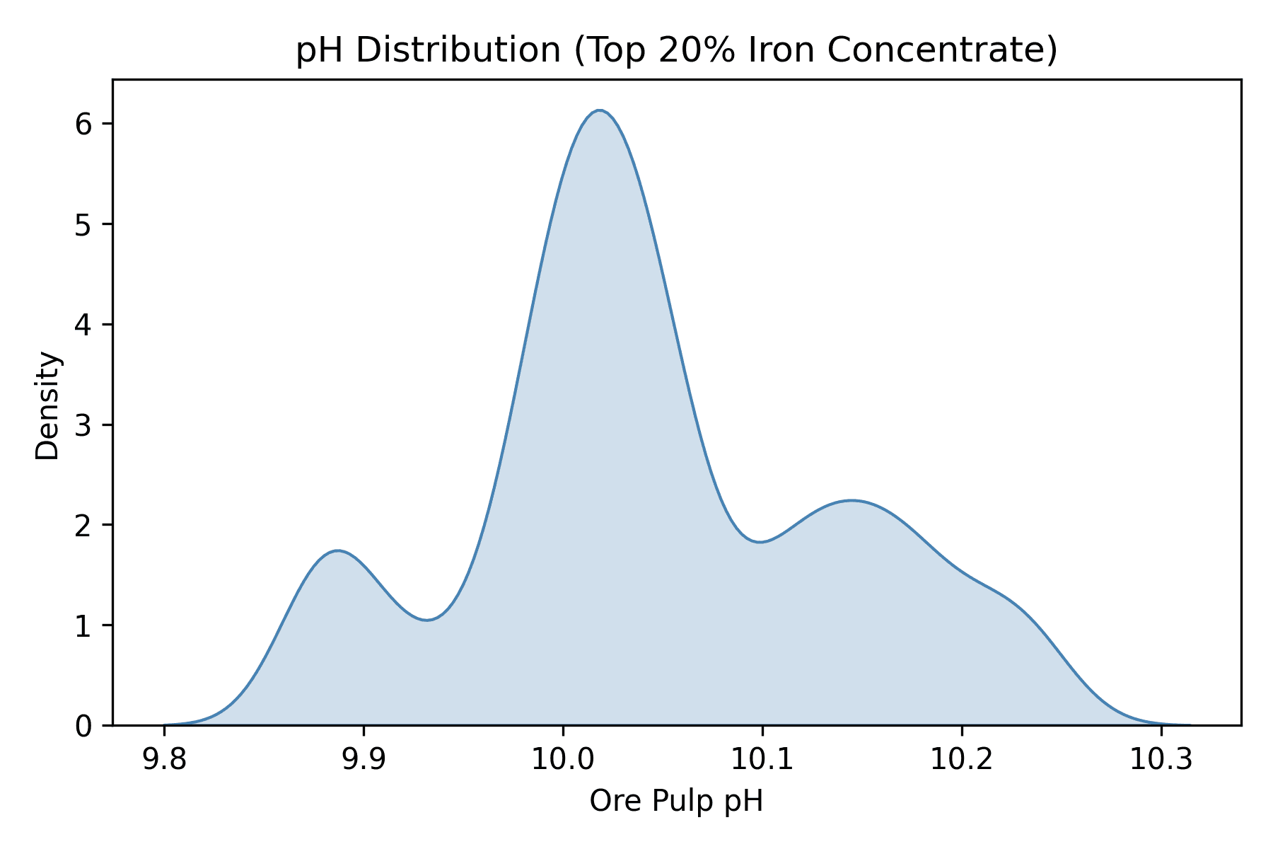
5. What is the distribution of pH levels?
What Code did I run?
To understand how pH levels were distributed during high-yield periods, I focused on rows where % Iron Concentrate was in the top 20%. I used a KDE plot (Kernel Density Estimate) to visualize the spread of Ore Pulp pH values in those cases.
Python Functions I Used:
quantile(0.80)to filter for the top 20% iron yield
sns.kdeplot()from Seaborn to create a smoothed density curveplt.savefig()to export the plot as a PNG for the projectplt.title(),plt.xlabel(),plt.ylabel()to label the chart

What Is the Output?
The result gave me a sorted list of average values when iron yield was at its lowest. At the top of the list were:
Starch Flow: 3701.4
Amina Flow: 485.7
Foam Levels: ~600 in Columns 01–03
Ore Pulp pH: around 9.90
Air flows were relatively stable, around 299–300 across all columns.
What Does This Tell Us?
When iron output is poor, I noticed that chemical usage—especially starch and amina—is noticeably higher. Also, the flotation levels in the first few columns tend to be elevated. This might point to overdosing reagents or allowing too much foam early in the process. Meanwhile, air flows don’t seem to vary much, and the pH stays just below 9.91. These averages gave me a clearer picture of what’s going on when performance drops, which could help avoid inefficiencies in future runs.

What is the output?
This produced a smooth KDE curve showing the density of Ore Pulp pH values when iron yield was high. The curve peaks near pH 10.0, indicating this was the most common pH value among the top 20% yield rows. The range is tightly clustered between about 9.8 and 10.2.
What does this tell us?
The visualization suggests that iron separation works best in a fairly narrow pH range. Most high-performing rows had Ore Pulp pH values between 9.8 and 10.2, with a clear density peak around pH 10.0. This indicates that maintaining pH within this range may support higher iron concentration output — an actionable insight for process optimization.
6. Does airflow affect % Iron Concentrate?
What Code did I run?
To investigate if airflow in flotation columns impacts the percentage of iron concentrate, I selected all seven air flow variables and created individual scatter plots comparing each one to % Iron Concentrate. Then, I generated a correlation matrix heatmap to summarize the relationships across all columns.
Python Functions I Used:
sns.scatterplot()– to visualize the relationship between each airflow column and % Iron Concentratedf.corr()– to calculate the correlation matrixsns.heatmap()– to plot the matrix of correlation valuesplt.tight_layout(), plt.title(), plt.show()– for formatting and displaying the charts

This is the output?
To find the earliest and latest timestamps in the dataset, I used the .min() and .max() functions on the date column after converting it to datetime format:
2. What is the time range of the dataset?
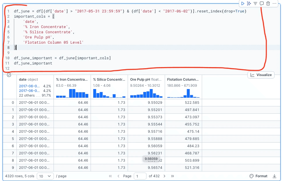
What happened on June 1, 2017, and how did key variables behave?
What Code did I run?
To understand how the plant was operating over a single 24-hour period, I focused specifically on June 1, 2017. This helped me study the short-term behavior of key process variables and spot patterns without noise from other dates.
Python Functions I Used:
• Boolean filtering: df[(condition)]
• Resetting index: .reset_index(drop=True)
• Subset columns: df[important_cols]
• Date range mask: df['date'] > "2017-05-31"
5. What is the distribution of pH levels?
What Code did I run?
To understand how pH levels were distributed during high-yield periods, I focused on rows where % Iron Concentrate was in the top 20%. I used a KDE plot (Kernel Density Estimate) to visualize the spread of Ore Pulp pH values in those cases.
Python Functions I Used:
quantile(0.80)to filter for the top 20% iron yield
sns.kdeplot()from Seaborn to create a smoothed density curveplt.savefig()to export the plot as a PNG for the projectplt.title(),plt.xlabel(),plt.ylabel()to label the chart
What does this tell us?
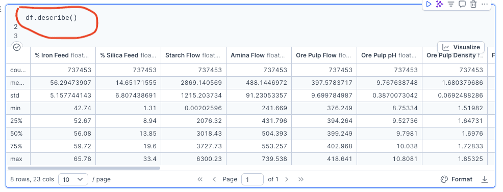
This table gives a quick overview of what is “normal” for each variable in the dataset.
We can spot:
Typical values (like average and median)
Strange values or outliers (based on extreme min/max)
Which features are consistent (low std) vs. highly variable (high std)
It’s a fast way to get familiar with the dataset before digging deeper.
Q1: What are the average, median, min, and max values for each column?
What is the output?
The result was a clean DataFrame showing only the variables I wanted to explore, across every hourly reading on June 1, 2017. It gave me a focused view of:
% Iron Concentrate
% Silica Concentrate
Ore Pulp pH
Flotation Column 05 Level
Each row represents one timestamp from that day. This filtered version made it easier to plot variable behavior without distractions from other days or unrelated columns.
What does this tell us?
Looking at the filtered data showed that:
Flotation level and pH fluctuated throughout the day.
% Iron and % Silica remained mostly stable.
The plant appeared to be operating steadily, but with some internal variation in chemical and mechanical conditions.
This daily snapshot gave me a baseline for deeper analysis in the next questions. It also confirmed that June 1 was a good day to explore in detail, as it captured typical process behavior with measurable changes.
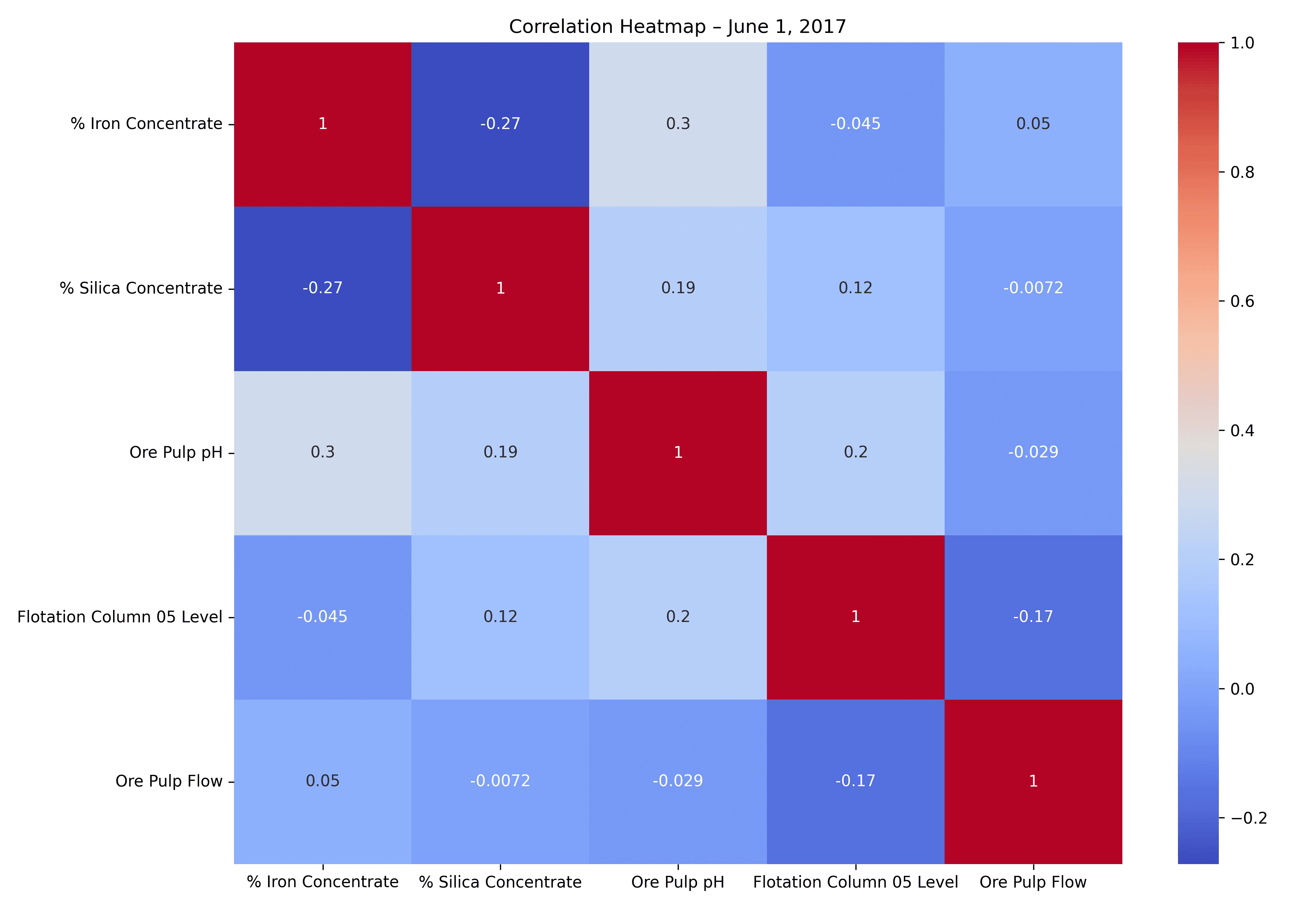
What is the output?
The result is a heatmap showing how strongly each pair of numeric variables is correlated. Here's the saved plot:
Each square represents a correlation value from -1 (strong negative) to +1 (strong positive). Lighter blue means a weaker correlation; darker red means a stronger one.
What does this tell us?
No strong correlations stand out. The highest value is 0.3 between Ore Pulp pH and % Iron Concentrate — a weak positive correlation.
% Silica Concentrate shows a mild negative relationship with % Iron Concentrate (−0.27), which makes sense in separation processes.
Other variables like Ore Pulp Flow and Flotation Level show almost no correlation with iron output that day.
This tells us the relationships are subtle and not strongly linear. We may need to explore nonlinear patterns or combine variables in later questions.
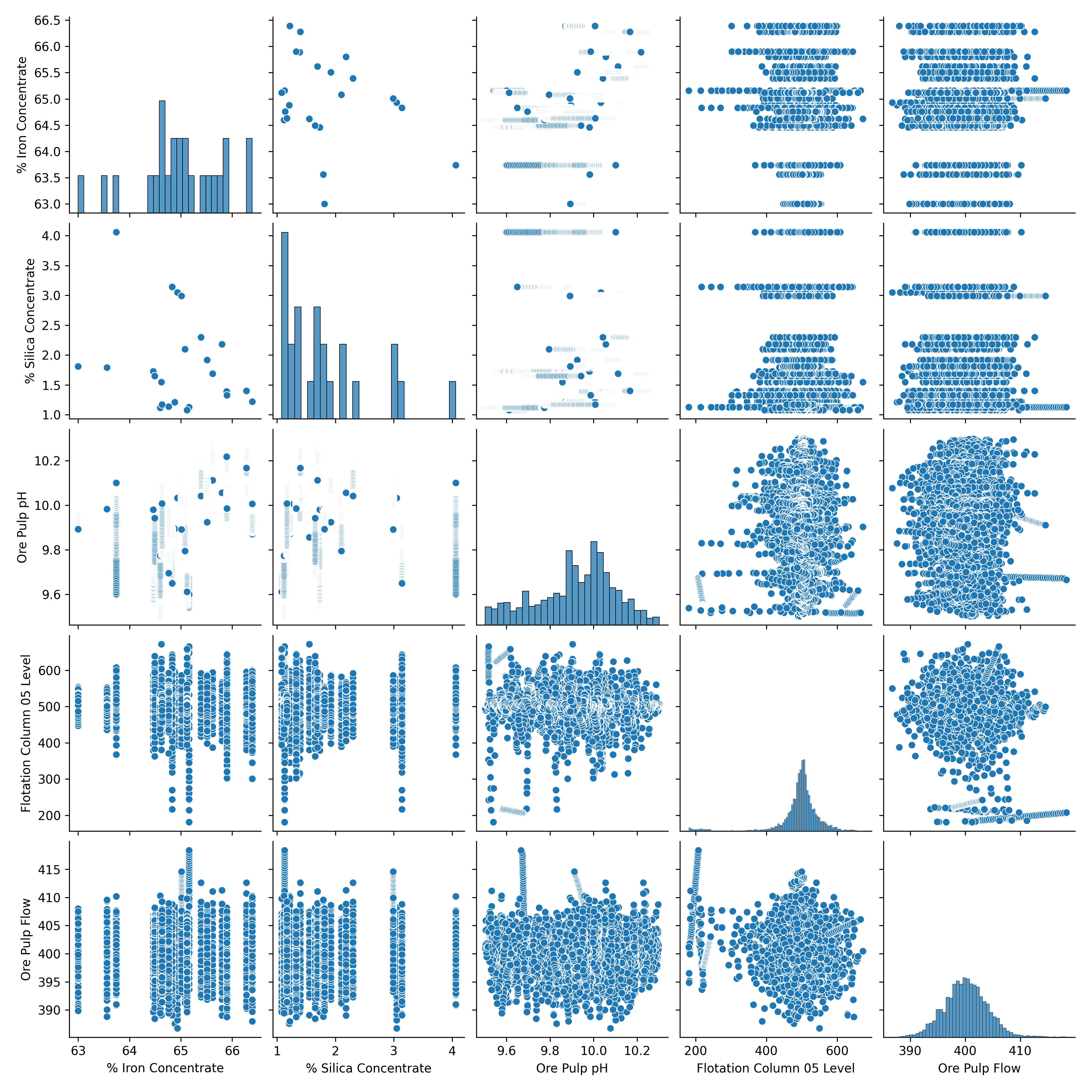
What Code Did I Run?
To visually support the correlation heatmap, I also created a Seaborn pairplot — a matrix of scatterplots showing every combination of numeric variables. This helped double-check whether any variables showed stronger linear or nonlinear trends.
Key Python Functions I Used:
sns.pairplot()to generate the grid of scatterplotsplt.savefig()to export it for use on my project page
What Does This Tell Us?
The pairplot confirms the same pattern seen in the heatmap — the relationships between variables are weak and scattered. Most plots show no clear trend or clustering, especially between % Iron Concentrate and other variables like chemical flow or flotation level. This further supports the idea that these variables don’t have strong direct influence — at least not in a linear way.
What is the output?
This produced a smooth KDE curve showing the density of Ore Pulp pH values when iron yield was high. The curve peaks near pH 10.0, indicating this was the most common pH value among the top 20% yield rows. The range is tightly clustered between about 9.8 and 10.2.
What does this tell us?
The visualization suggests that iron separation works best in a fairly narrow pH range. Most high-performing rows had Ore Pulp pH values between 9.8 and 10.2, with a clear density peak around pH 10.0. This indicates that maintaining pH within this range may support higher iron concentration output — an actionable insight for process optimization.
To get a quick summary of every numeric column in the dataset, I used this one-line Pandas command:
This function gives basic descriptive statistics for each column in the DataFrame.
Q1: What are the average, median, min, and max values for each column?

What is the output?
The result is a heatmap showing how strongly each pair of numeric variables is correlated. Here's the saved plot:
Each square represents a correlation value from -1 (strong negative) to +1 (strong positive). Lighter blue means a weaker correlation; darker red means a stronger one.
What does this tell us?
No strong correlations stand out. The highest value is 0.3 between Ore Pulp pH and % Iron Concentrate — a weak positive correlation.
% Silica Concentrate shows a mild negative relationship with % Iron Concentrate (−0.27), which makes sense in separation processes.
Other variables like Ore Pulp Flow and Flotation Level show almost no correlation with iron output that day.
This tells us the relationships are subtle and not strongly linear. We may need to explore nonlinear patterns or combine variables in later questions.
Optimizing Iron Yield with Python:
A Technical Exploration of the Flotation Process
Optimizing Iron Yield with Python:
A Technical Exploration of the Flotation Process

What is the output?
The result was a clean DataFrame showing only the variables I wanted to explore, across every hourly reading on June 1, 2017. It gave me a focused view of:
% Iron Concentrate
% Silica Concentrate
Ore Pulp pH
Flotation Column 05 Level
Each row represents one timestamp from that day. This filtered version made it easier to plot variable behavior without distractions from other days or unrelated columns.
What does this tell us?
Looking at the filtered data showed that:
Flotation level and pH fluctuated throughout the day.
% Iron and % Silica remained mostly stable.
The plant appeared to be operating steadily, but with some internal variation in chemical and mechanical conditions.
This daily snapshot gave me a baseline for deeper analysis in the next questions. It also confirmed that June 1 was a good day to explore in detail, as it captured typical process behavior with measurable changes.

Why I Did This Project
I wanted to practice real-world data cleaning and analysis using Python — not just run textbook examples. When I found this mining flotation dataset on Kaggle, I saw a chance to apply technical skills like data wrangling, plotting, and condition filtering on actual industrial process data. My goal wasn’t to solve the whole mining process, but to see what Python could uncover about what affects iron yield.
I didn’t know much about flotation plants or iron recovery when I started, but that made it even more interesting. I wanted to see if I could uncover patterns in the chemical and physical processes and figure out what influences iron concentration — just by analyzing the numbers.
This project pushed me to explore new tools and concepts — from fixing decimal issues to working with time-based variables, flow measurements, and KDE plots — and helped me think more like a data scientist solving real problems. Everything was done inside Deepnote to keep the workflow clean, reproducible, and organized.


What This Project Shows About My Skills
This project breaks down what conditions actually lead to stronger or weaker iron output — using Python to analyze a real industrial dataset. You'll see how small changes in chemical flow, pH levels, and flotation air pressure influence final yield.
Even if you're not familiar with mining or engineering, this walkthrough shows how data can tell the story. I used Python to filter low vs. high yield cases, visualize distributions, and compare average conditions. Along the way, I built scatter plots, KDE curves, and ranked factors to uncover what’s really driving iron performance.
If you're a recruiter and want to quickly understand what my strongest technical skills are — keep reading. You'll see hands-on work with pandas, seaborn, matplotlib, and real-time data filtering and visualization — all applied to a practical use case.
Whether you're learning data analysis or hiring for it, this project has something worth exploring.
I wanted to practice real-world data cleaning and analysis using Python — not just run textbook examples. When I found this mining flotation dataset on Kaggle, I saw a chance to apply technical skills like data wrangling, plotting, and condition filtering on actual industrial process data. My goal wasn’t to solve the whole mining process, but to see what Python could uncover about what affects iron yield.
I didn’t know much about flotation plants or iron recovery when I started, but that made it even more interesting. I wanted to see if I could uncover patterns in the chemical and physical processes and figure out what influences iron concentration — just by analyzing the numbers.
This project pushed me to explore new tools and concepts — from fixing decimal issues to working with time-based variables, flow measurements, and KDE plots — and helped me think more like a data scientist solving real problems. Everything was done inside Deepnote to keep the workflow clean, reproducible, and organized.

Where the Dataset Comes From
TThis dataset comes from Kaggle and is titled “Mining Process — Flotation Plant Database.” It contains real-world sensor data collected from a flotation plant used in iron and copper ore processing.
The dataset includes:
Over 7,300 hourly records
24 columns covering chemical inputs, process settings, and output measurements
Variables like
% Iron Concentrate,% Silica Concentrate,Starch Flow,Amina Flow,Ore Pulp pH, and air flow/foam level across flotation columns 01 to 07
Some columns are sampled every 20 seconds, others hourly. The goal of the original dataset is to help engineers reduce silica (impurity) levels and improve iron yield.
For this project, I downloaded the CSV file directly from Kaggle, imported it into Deepnote, and cleaned it using pandas — including fixing decimal formatting and converting timestamps.
Full Analysis – What I Asked the Data
What are the average, median, min, and max values for each column?
What is the time range of the dataset?
What happened on June 1, 2017, and how did key variables behave?
Are there any clear correlations between the variables?
What is the distribution of pH levels?
Does airflow affect % Iron Concentrate?
Does flotation foam level affect % Iron Concentrate?
Do starch and amina chemical flows improve or worsen iron yield?
Is there an optimal pH range for separation?
What conditions are common when iron output is poor?
What code did I run?
What code did I run?
Where the Dataset Comes From
TThis dataset comes from Kaggle and is titled “Mining Process — Flotation Plant Database.” It contains real-world sensor data collected from a flotation plant used in iron and copper ore processing.
The dataset includes:
Over 7,300 hourly records
24 columns covering chemical inputs, process settings, and output measurements
Variables like
% Iron Concentrate,% Silica Concentrate,Starch Flow,Amina Flow,Ore Pulp pH, and air flow/foam level across flotation columns 01 to 07
Some columns are sampled every 20 seconds, others hourly. The goal of the original dataset is to help engineers reduce silica (impurity) levels and improve iron yield.
For this project, I downloaded the CSV file directly from Kaggle, imported it into Deepnote, and cleaned it using pandas — including fixing decimal formatting and converting timestamps.
What is the output?
It generates a table showing:
count– how many non-missing values there aremean– the average valuestd– standard deviation (how spread out the values are)min– the smallest value25%,50%(median),75%– percentilesmax– the largest value
What is the output?
It generates a table showing:
count– how many non-missing values there aremean– the average valuestd– standard deviation (how spread out the values are)min– the smallest value25%,50%(median),75%– percentilesmax– the largest value
Part I Project Setup Python in Deepnote
Part II Technical Walkthrough
What happened on June 1, 2017, and how did key variables behave?
What Code did I run?
To understand how the plant was operating over a single 24-hour period, I focused specifically on June 1, 2017. This helped me study the short-term behavior of key process variables and spot patterns without noise from other dates.
Python Functions I Used:
• Boolean filtering: df[(condition)]
• Resetting index: .reset_index(drop=True)
• Subset columns: df[important_cols]
• Date range mask: df['date'] > "2017-05-31"
2. What is the time range of the dataset?
What code did I run?
To find the earliest and latest timestamps in the dataset, I used the .min() and .max() functions on the date column after converting it to datetime format:
What does this tell us?
The dataset spans from March 10 to September 9, 2017 — almost six full months of operational data. This gives me enough historical coverage to analyze trends, spot unusual events, and zoom in on specific days like June 1.
What code did I run?
To get a quick summary of every numeric column in the dataset, I used this one-line Pandas command:
This function gives basic descriptive statistics for each column in the DataFrame.
What is the output?
It generates a table showing:
count– how many non-missing values there aremean– the average valuestd– standard deviation (how spread out the values are)min– the smallest value25%,50%(median),75%– percentilesmax– the largest value
Are there any clear correlations between the variables?
What Code did I run?
To explore whether certain process variables tend to move together, I calculated a correlation matrix using .corr() and visualized it with a heatmap. I focused on continuous numeric features such as chemical flows, pH, and flotation performance.
Python Functions I Used:
df.corr() to generate a correlation matrix
seaborn.heatmap()to visualize the correlation strengthcmap='coolwarm'to clearly show positive (red) and negative (blue) relationshipsannot=Trueto display numeric values inside each cell
What This Project Shows About My Skills
This project breaks down what conditions actually lead to stronger or weaker iron output — using Python to analyze a real industrial dataset. You'll see how small changes in chemical flow, pH levels, and flotation air pressure influence final yield.
Even if you're not familiar with mining or engineering, this walkthrough shows how data can tell the story. I used Python to filter low vs. high yield cases, visualize distributions, and compare average conditions. Along the way, I built scatter plots, KDE curves, and ranked factors to uncover what’s really driving iron performance.
If you're a recruiter and want to quickly understand what my strongest technical skills are — keep reading. You'll see hands-on work with pandas, seaborn, matplotlib, and real-time data filtering and visualization — all applied to a practical use case.
Whether you're learning data analysis or hiring for it, this project has something worth exploring.
I wanted to practice real-world data cleaning and analysis using Python — not just run textbook examples. When I found this mining flotation dataset on Kaggle, I saw a chance to apply technical skills like data wrangling, plotting, and condition filtering on actual industrial process data. My goal wasn’t to solve the whole mining process, but to see what Python could uncover about what affects iron yield.
I didn’t know much about flotation plants or iron recovery when I started, but that made it even more interesting. I wanted to see if I could uncover patterns in the chemical and physical processes and figure out what influences iron concentration — just by analyzing the numbers.
This project pushed me to explore new tools and concepts — from fixing decimal issues to working with time-based variables, flow measurements, and KDE plots — and helped me think more like a data scientist solving real problems. Everything was done inside Deepnote to keep the workflow clean, reproducible, and organized.
Are there any clear correlations between the variables?
What Code did I run?
To explore whether certain process variables tend to move together, I calculated a correlation matrix using .corr() and visualized it with a heatmap. I focused on continuous numeric features such as chemical flows, pH, and flotation performance.
Python Functions I Used:
df.corr() to generate a correlation matrix
seaborn.heatmap()to visualize the correlation strengthcmap='coolwarm'to clearly show positive (red) and negative (blue) relationshipsannot=Trueto display numeric values inside each cell
What is the output?
It generates a table showing:
count– how many non-missing values there aremean– the average valuestd– standard deviation (how spread out the values are)min– the smallest value25%,50%(median),75%– percentilesmax– the largest value
What does this tell us?
This table gives a quick overview of what is “normal” for each variable in the dataset.
We can spot:
Typical values (like average and median)
Strange values or outliers (based on extreme min/max)
Which features are consistent (low std) vs. highly variable (high std)
It’s a fast way to get familiar with the dataset before digging deeper.
What does this tell us?
The dataset spans almost 6 months, from March 10th to September 9th, 2017.
This helps us understand how much data we’re working with and lets us decide what time ranges to zoom into for deeper analysis—like we later did with June 1st.
What does this tell us?
The dataset spans from March 10 to September 9, 2017 — almost six full months of operational data. This gives me enough historical coverage to analyze trends, spot unusual events, and zoom in on specific days like June 1.
Full Analysis – What I Asked the Data
What Code Did I Run?
To visually support the correlation heatmap, I also created a Seaborn pairplot — a matrix of scatterplots showing every combination of numeric variables. This helped double-check whether any variables showed stronger linear or nonlinear trends.
Key Python Functions I Used:
sns.pairplot()to generate the grid of scatterplotsplt.savefig()to export it for use on my project page
What Does This Tell Us?
The pairplot confirms the same pattern seen in the heatmap — the relationships between variables are weak and scattered. Most plots show no clear trend or clustering, especially between % Iron Concentrate and other variables like chemical flow or flotation level. This further supports the idea that these variables don’t have strong direct influence — at least not in a linear way.
Part I Project Setup Python in Deepnote
Part II Technical Walkthrough
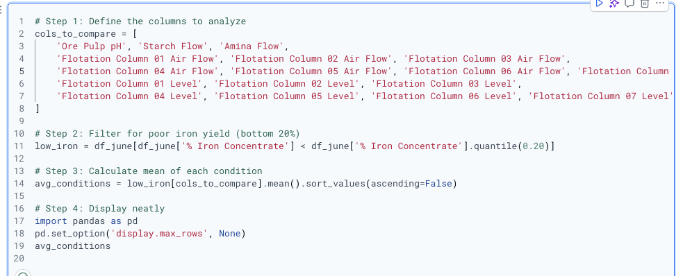
What conditions are common when iron output is poor?
What Code did I run?
o answer this, I filtered the dataset to include only the bottom 20% of iron yield cases. I wanted to see what the average values looked like for process variables like pH, chemical flows, air flow, and flotation foam levels when % Iron Concentrate was at its worst. I used .mean() to calculate the average of each condition and sorted the results to find what stood out.
What is the output?
7 scatter plots were generated (I am showing 1 for Column 02)
A correlation heatmap showing how each air flow variable relates to % Iron Concentrate
Most correlation values were between 0.00 and 0.10
The only strong correlation (r = 0.53) was between Column 06 and Column 07 air flow — with each other, not with iron output
What does this tell us?
No meaningful correlation exists between any individual air flow variable and % Iron Concentrate
The scatter plots showed no visible trends
The heatmap confirmed weak or no relationships
Column 06 and 07 appear to be linked (possibly co-controlled), but they don’t influence iron output
Conclusion: Adjusting airflow alone likely does not improve iron concentration
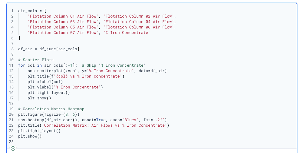
6. Does airflow affect % Iron Concentrate?
What Code did I run?
To investigate if airflow in flotation columns impacts the percentage of iron concentrate, I selected all seven air flow variables and created individual scatter plots comparing each one to % Iron Concentrate. Then, I generated a correlation matrix heatmap to summarize the relationships across all columns.
Python Functions I Used:
sns.scatterplot()– to visualize the relationship between each airflow column and % Iron Concentratedf.corr()– to calculate the correlation matrixsns.heatmap()– to plot the matrix of correlation valuesplt.tight_layout(), plt.title(), plt.show()– for formatting and displaying the charts
What is the output?
7 scatter plots were generated (I am showing 1 for Column 02)
A correlation heatmap showing how each air flow variable relates to % Iron Concentrate
Most correlation values were between 0.00 and 0.10
The only strong correlation (r = 0.53) was between Column 06 and Column 07 air flow — with each other, not with iron output
What does this tell us?
No meaningful correlation exists between any individual air flow variable and % Iron Concentrate
The scatter plots showed no visible trends
The heatmap confirmed weak or no relationships
Column 06 and 07 appear to be linked (possibly co-controlled), but they don’t influence iron output
Conclusion: Adjusting airflow alone likely does not improve iron concentration
What is the output?
I generated a correlation heatmap showing how foam level readings from each flotation column relate to % Iron Concentrate.
Most correlations ranged from -0.10 to +0.10 (very weak).
The only notable value was:
Flotation Column 07 Level → -0.48 — a moderate negative correlation.
What does this tell us?
Most foam levels show little to no relationship with iron output.
Column 07 Level might be inversely related to % Iron Concentrate. As its foam level rises, iron yield may slightly drop.
No foam level showed a strong positive impact.
Overall: Foam level adjustments do not consistently influence % Iron Concentrate and are not strong predictors.
7 . Does flotation foam level affect % Iron Concentrate?
What Code did I run?
To understand whether flotation foam level affects % Iron Concentrate, I selected the foam level readings from Columns 01–07, along with the iron concentration values. Then I created a correlation matrix heatmap to analyze relationships.
Python Functions I Used:
df[column_list]to select only the level columns + iron concentratedf.corr()to generate the correlation matrixsns.heatmap()to visualize correlation strengthscmap='Greens'to highlight values in shades of greenplt.savefig()to export the heatmap tolevel_vs_iron_corr_matrix.png
What conditions are common when iron output is poor?
What Code did I run?
o answer this, I filtered the dataset to include only the bottom 20% of iron yield cases. I wanted to see what the average values looked like for process variables like pH, chemical flows, air flow, and flotation foam levels when % Iron Concentrate was at its worst. I used .mean() to calculate the average of each condition and sorted the results to find what stood out.
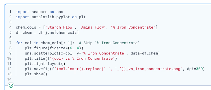
8 . Do starch and amina chemical flows improve or worsen iron yield?
To explore whether the chemical flows (starch and amina) were helping or hurting iron yield, I wrote a loop to plot each of them against % Iron Concentrate. I wanted to visually see if more chemical input was linked to better iron output.
Python Functions I Used:
sns.scatterplot() to visualize relationships between each flow and iron output
plt.savefig()to export the charts to my project folder
What Is the Output?
I generated two scatter plots:
One for Starch Flow vs. % Iron Concentrate
One for Amina Flow vs. % Iron Concentrate
In both charts, the data points were spread widely with no clear line or shape — basically, no strong trend popped out.
What Is the Output?
You generated a correlation heatmap showing how foam level readings from each flotation column relate to % Iron Concentrate.
Most correlations ranged from -0.10 to +0.10 (very weak).
The only notable value was:
Flotation Column 07 Level → -0.48 — a moderate negative correlation.
What Does This Tell Us?
Most foam levels show little to no relationship with iron output.
Column 07 Level might be inversely related to % Iron Concentrate. As its foam level rises, iron yield may slightly drop.
No foam level showed a strong positive impact.
Overall: Foam level adjustments do not consistently influence % Iron Concentrate and are not strong predictors.
Do these variables seem to control iron quality?
After working through all ten questions in the analysis, I can say that no single variable fully controls iron yield on its own. The correlation heatmaps and scatter plots showed mostly weak relationships. pH had a mild positive correlation, and foam level in Column 07 showed a mild negative one. Airflow looked mostly random. Chemical flows like starch and amina didn't show a clear linear trend either.
What this tells me is that iron concentrate quality is influenced by a mix of small effects — not one dominant factor. It seems like the process is sensitive to how multiple inputs interact together. That means I can't point to just one lever to pull for better output, but I now have a clearer picture of which variables are worth watching.
Let’s Build Smarter—and Bigger—with Data
This project started with mining data, but the skills and thinking behind it apply directly to fast-moving, data-driven companies — especially in online payments and real-time transaction systems. That’s why I’m applying for the Associate Data Engineer role at North.
I’ve built this analysis from scratch using both Python and SQL, and I’m confident in my ability to work with complex datasets, optimize data flows, and turn raw numbers into insights. Whether it’s analyzing performance, improving data pipelines, or helping teams make better decisions, I’m ready to contribute.
If you’d like to see more of what I can do, you can check out my work at lubobali.com or connect with me on LinkedIn. I’m excited about the chance to bring this level of thinking and technical skill to a company like North.
Let’s build something efficient, insightful, and scalable — together.
Can we make operational recommendations from the data?
Yes, even though no single variable fully explains the outcome, the analysis pointed to two areas where adjustments might help.
First, the pH data stood out. The KDE plot for high-yield rows showed that top-performing outputs tend to happen when ore pulp pH is between 9.8 and 10.2. That range was very consistent in the best results. I’d recommend keeping pH in that band to help maintain strong separation.
Second, the low-yield analysis revealed something unexpected — starch flow was actually higher when iron output was worse. That makes me think we might be overdosing starch. Cutting back and testing lower dosage levels could reduce waste and possibly improve recovery.
As for other variables like airflow or flotation foam level, the evidence suggests they don’t have a strong direct impact unless they’re part of a broader change. I’d focus operational tweaks on pH control and starch adjustment before anything else.
What Is the Output?
The result gave me a sorted list of average values when iron yield was at its lowest. At the top of the list were:
Starch Flow: 3701.4
Amina Flow: 485.7
Foam Levels: ~600 in Columns 01–03
Ore Pulp pH: around 9.90
Air flows were relatively stable, around 299–300 across all columns.
What Does This Tell Us?
When iron output is poor, I noticed that chemical usage—especially starch and amina—is noticeably higher. Also, the flotation levels in the first few columns tend to be elevated. This might point to overdosing reagents or allowing too much foam early in the process. Meanwhile, air flows don’t seem to vary much, and the pH stays just below 9.91. These averages gave me a clearer picture of what’s going on when performance drops, which could help avoid inefficiencies in future runs.
What Does This Tell Us?
From what I saw, neither starch nor amina flow had a meaningful relationship with iron yield. No matter how much of these chemicals was used, the % Iron Concentrate stayed all over the place.
This tells me that adjusting starch or amina flow alone isn’t likely to boost or drop iron output in a predictable way. If they help, it's probably through more complex interactions — not a simple cause-effect.
7 . Does flotation foam level affect % Iron Concentrate?
What Code did I run?
To understand whether flotation foam level affects % Iron Concentrate, I selected the foam level readings from Columns 01–07, along with the iron concentration values. Then I created a correlation matrix heatmap to analyze relationships.
Python Functions I Used:
df[column_list]to select only the level columns + iron concentratedf.corr()to generate the correlation matrixsns.heatmap()to visualize correlation strengthscmap='Greens'to highlight values in shades of greenplt.savefig()to export the heatmap tolevel_vs_iron_corr_matrix.png
Do starch and amina chemical flows improve or worsen iron yield?
What Code did I run?
To explore whether the chemical flows (starch and amina) were helping or hurting iron yield, I wrote a loop to plot each of them against % Iron Concentrate. I wanted to visually see if more chemical input was linked to better iron output.
Python Functions I Used:
sns.scatterplot()to visualize relationships between each flow and iron outputplt.savefig()to export the charts to my project folder

What Is the Output?
I generated two scatter plots:
One for Starch Flow vs. % Iron Concentrate
One for Amina Flow vs. % Iron Concentrate
In both charts, the data points were spread widely with no clear line or shape — basically, no strong trend popped out.
What Does This Tell Us?
From what I saw, neither starch nor amina flow had a meaningful relationship with iron yield. No matter how much of these chemicals was used, the % Iron Concentrate stayed all over the place.
This tells me that adjusting starch or amina flow alone isn’t likely to boost or drop iron output in a predictable way. If they help, it's probably through more complex interactions — not a simple cause-effect.